Designing a Conservation Science Poster?
Focus on key ideas
Posters need to attract your audience and convey a few key ideas. If you have never been to a poster session, imagine a marketplace with dozens of merchants trying to hawk their wares to hundreds of potential customers in a single crowded room. In this case the merchants are very demure; they would not dream of loudly exhorting the crowd to gather at their poster. They just stand beside their poster as people wander around, hoping that their poster will catch the eye of an interested person. When people stop a conversation will probably ensue, perhaps for only a minute or two, perhaps much longer.
In this setting the key to brisk sales is an eye-catching poster and this probably means both an intriguing title and one or two large, attractive images . . . literally attractive. It is possible to go overboard with a cute title, but certainly almost anything would be better than: "Life history of the alpine lily, an endangered species" or "Visitor attitudes toward conservation at Alpine National Park." The first requirement for an attractive image is that it be large enough to be clearly visible from 2 or 3 meters away. Secondly, it should attempt to engage the viewer and make them want to find out more: What are those people doing? What kind of creature is that?
Once you have a person's attention you can initiate a conversation with a question such as,"Would you like to hear about my work?" and if the answer is "yes" then you have a few minutes to deliver your message.You should probably aim for about 3–5 minutes, but it may easily extend longer if you are asked questions, a good sign that the person is genuinely interested and not just being polite. During your mini-presentation the main function of the poster will be to provide some key figures or tables you need to display your results and perhaps a map to show where you work. Figures are usually preferable to tables, especially because they are easier to interpret from a modest distance, but sometimes a table will work better.
If the key elements of a poster are a title and image to attract a listener and then some figures to use while talking about your results, then why is the typical poster cluttered with lots of text material? There are two answers: first, some posters are designed to be read while the presenter is absent; second, most posters try to present far more material than can be realistically absorbed by the average reader in the time they will spend standing before a poster. The first issue is easily resolved by determining the structure of the poster session; if they are on display for an extended period then that calls for a different design than if they will be visible for only a couple hours when you are present. If the poster needs to stand alone, you will need some bare-bones text to lead readers through the main parts of your paper: an Introduction to provide some context, Methods to describe what you did, and so on, perhaps 200–500 words at most. The mistake people make most often is overwhelming their reader. Surrounded by scores of other posters that are competing for attention it will be unusual for anyone to spend more than 5 minutes reading your poster, unless the topic particularly interests them. First, you need to ask yourself, how much material can I actually convey to a reader in 5 minutes? Then you to need to organize that material in a visually accessible design.This means large, simple fonts, an outline format based on key phrases, and, most important of all, avoiding excessive text.
Imagine standing in front of a poster reading the preceding paragraph compared with seeing its essence distilled like this:
Why are posters cluttered?
- Designed for reading, not presenting
- Provide too much material Solutions
- Limit material to 5 minutes' worth
- Use an outline format
Sure, some nuance is lost in the latter version, but which one will you actually take the time to read in the midst of a poster session and which one is more likely to stick with you?
Create a first draft
Aim to have a first draft of your poster done a couple weeks before the conference so that your advisor and others can review it for you. Some fresh sets of eyes will almost certainly identify some opportunities for major improvements. For people who are really interested in your work it can be useful to have a short handout, say both sides of a sheet of paper, that contains your abstract and key figures. These can be left in a large envelope hanging from the poster if it is unattended at times. Of course, this handout should contain your contact information so that the interaction can continue by phone or email after the conference. Conversely, you should be prepared to collect contact information for people that you want to contact later. Obviously face-to-face interactions are best and you might want to suggest meeting for a meal later in the conference if you think this would be fruitful.
Many first-time poster presenters are disappointed with the volume of interactions; you are likely to spend more time standing alone than engaged in animated conversation. This is not a reflection of the quality of your work. The reality is that poster sessions are social events and many participants will be more focused on chatting with colleagues than viewing posters. One way to avoid standing alone is to interact with other nearby poster presenters. Ask them to describe their posters and they will almost certainly reciprocate.
by Malcolm L. Hunter, Jr., David Lindenmayer, Aram Calhoun
Remember, your scientific poster is a presentation of data and results with a short written discussion of your research at a scientific meeting. Using clear, consise writing, self-explainatory tables and graphics as well as good design techniques, a person should be able to fully read your poster in less than 10 minutes. It should be readable from 2 meters away and a good rule of thumb is to include 35 percent blank space.
Don’t be afraid to edit and simplify.
Example Posters
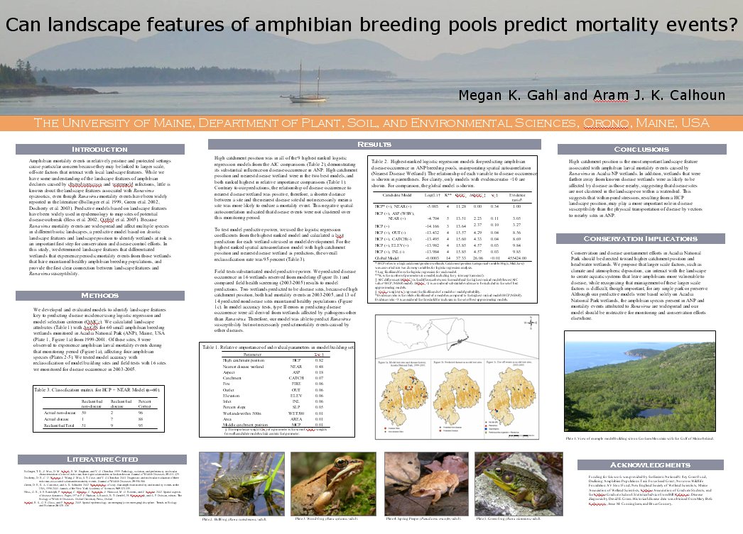
Poster 1 is a traditional poster with substantial blocks of text. Although this version has only 740 words of core text (1436 including legends, titles, literature cited, etc.), it still is so dense that most passersby will not take the time to read it.
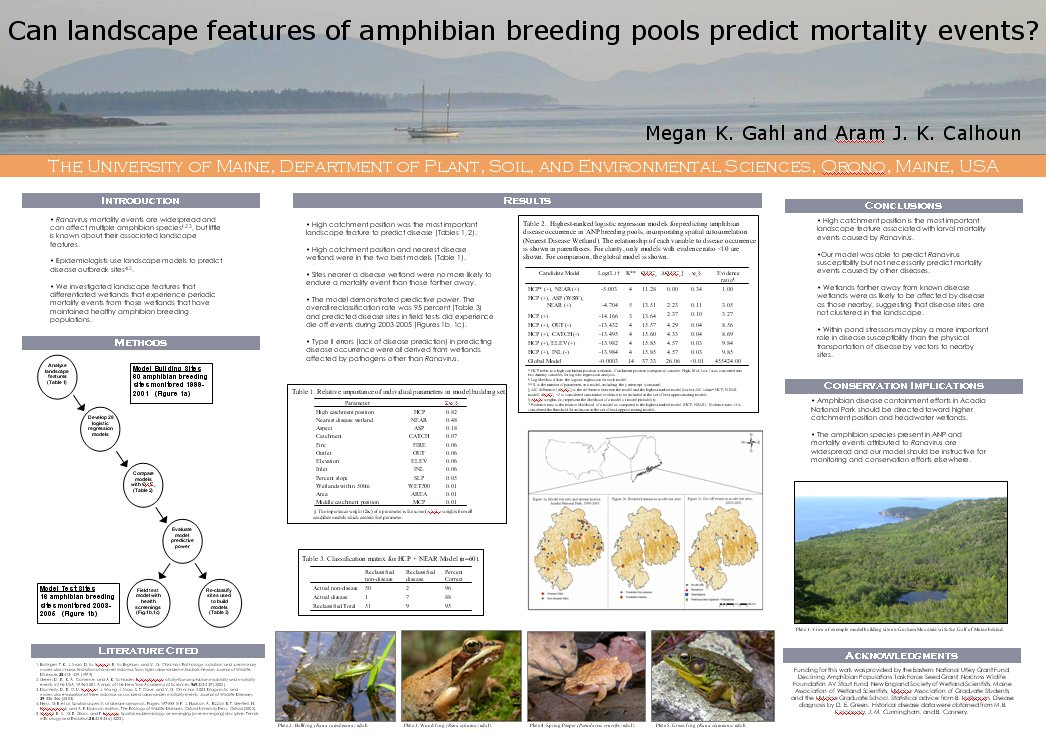
Poster 2 is much abbreviated from the traditional version with only 337 words of core text (1023 inclusive), but the central ideas are still conveyed. This format is much more inviting for a passerby, allowing a reader to understand the significant conservation implications of the project in less than 5 minutes.
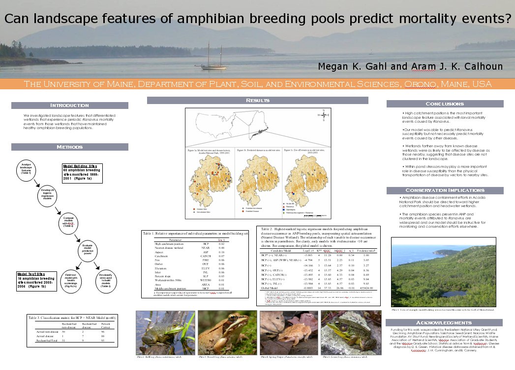
Poster 3 is shorter still with a reduced introduction, methods presented as a flow chart, and results presented only in figures. This version would probably be optimal for a poster session during which the presenter is always available to talk people through the poster. Nevertheless, even with only 209 words of core text (727 words total text) the poster can still be understood as a stand alone.
More Resources and Examples:
These and many other books and websites offer excellent advice for putting together your poster and your presentation:
- "Designing Conference Posters" by Colin Purrington
- Hunter, M.L., D.B. Lindenmayer, and A.J.K. Calhoun 2007. Saving the Earth as a career: Advice on becoming a conservation professional. Blackwell Publishing, Oxford, United Kingdom.
– PLEASE do not copy this resource for your own website –
This resource is property of SCB, with exerpts from "Saving the Earth as a career: Advice on becoming a conservation professional" by Malcolm L. Hunter, Jr., David Lindenmayer, Aram Calhoun. You may link to this resource, but you may NOT copy/paste this material without the express written permission of the authors.